
This week in my class of EDCI 337 we learned the principles of multimedia design via PowerPoints and infographics. We learned the differences between infographics and Powerpoint, how to create a visually appealing media presentation.
An example of a clear infographic and PowerPoint.


These examples are what we should try to strive for as a media, PowerPoints should have these 6 principles.
- One idea per slide, this is so you don’t overload your audience with tons of information
- No more than 6 objects per slide, having more items than 6 on a slide can feel claustraphobic
- Don’t read text, this is a big one is the presente should not read off their slide the audience can do that
- use illustrative image and short text, tell a story and narrate your slide
- Make the main idea the most prominent item on the slide
- use contrast to move the audience and key words.
I found that for PowerPoints unless it is a really well-researched topic the presentation would not turn out well, some of the 6 principles I did not know beforehand and think will benefit me in the future. In the past I think we have not accepted great presentations because we don’t say anything to help improve the presentee, we don’t give them the knowledge or resources to understand the questions being asked.
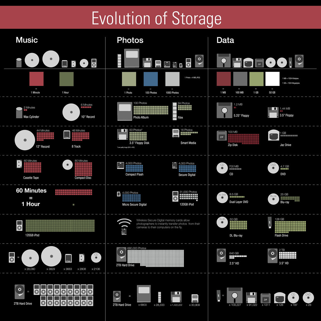
An example of this infographic would be described as chaotic with each graph beside each picture, Giving us too much information at one given time.
Here is an example of the infographics and PowerPoint I created based on what I learned.
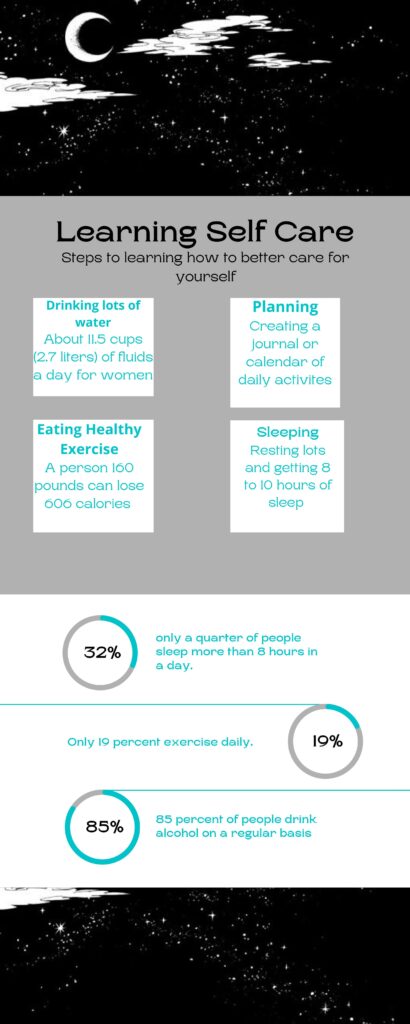
https://docs.google.com/presentation/d/1T0rS_UJEDfgZBzgnXHyXmfIXC5FpIq5nzZCqKN4n72g/edit?usp=sharing
zonyyang 2021-12-01
Hi,
The infographics you provide are so creative! You used good examples to explain how to create a good infographic, I think you have a really good understanding of using multimedia principles to make learners’ study experience better. Nice blog!
Jun Yang
queenieyao 2021-12-05
Hi
Love your creative and good look infographic and the principles of make Powerpoint really useful.
qixingyu 2021-12-06
Hi
thank you for sharing your own infographic, it is very nice and clear. You actully use the principles into the graph.